Advanced Search

Got an opinion on a web page design?…

Recent Forums Main Forum Off Topic Got an opinion on a web page design?…

Viewing 8 posts - 1 through 8 (of 8 total)
  • Author
    Posts
  • #40033
    developer (ChrisB)
    Keymaster
    • Topics: 52
    • Replies: 263

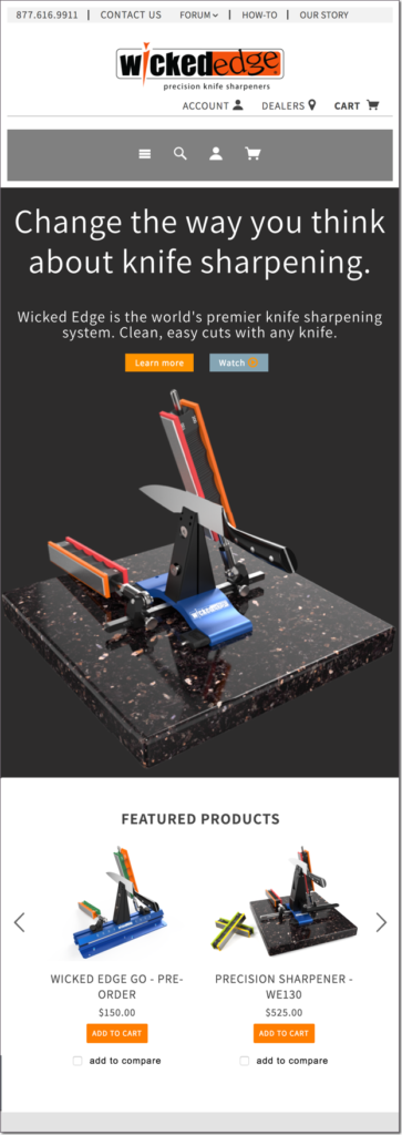
    We’re looking for your opinions on this new section on the home page of our website. Better or worse than the current? Please put on your marketing critic hat and let us know – and thank you! The upper image is the mobile version, and the lower is the desktop version.

    Working to make knife.wickededgeusa.com a great forum!

    #40038
    Marc H
    Moderator
    • Topics: 74
    • Replies: 2735

    My back round behind the pictured Wicked Edge System is white, and the white is all-the-way down.  I think the one you have pictured with the black/white split screen is better looking.  All white is too sterile.

    Marc
    (MarcH's Rack-Its)

    2 users thanked author for this post.
    #40048
    Mark76
    Participant
    • Topics: 179
    • Replies: 2760

    I also like the black/white home page (shown here) a little better, although I think the current home page is very good, too. My consideration is purely from an aesthetic point of view. I think that from a marketing point of view there is very little difference (although a better looking site may also be better from a marketing point of view; but I think here the differences are small and personal as well).

    Molecule Polishing: my blog about sharpening with the Wicked Edge

    2 users thanked author for this post.
    #40196
    Organic
    Participant
    • Topics: 17
    • Replies: 929

    The new home page looks really good. I think the charcoal background helps give definition to the sections as you scroll down. Nicely done!

    2 users thanked author for this post.
    #40197
    Marc H
    Moderator
    • Topics: 74
    • Replies: 2735

    Yes, very nice!

    Marc
    (MarcH's Rack-Its)

    2 users thanked author for this post.
    #40199
    Josh
    Participant
    • Topics: 89
    • Replies: 1672

    I like the new design… has a nice theme to it and the dark grey background splits up the white which is nice – easier on the eyes

    2 users thanked author for this post.
    #40200
    developer (ChrisB)
    Keymaster
    • Topics: 52
    • Replies: 263

    So we ran a split test of the new design for a few days, keeping 50% of traffic on the original version, and 50% on the new version. Overall, the new version performed better on a few dimensions (bounce rate, average time on site, product views, etc.). Although, it didn’t win by a landslide.

    Thanks again for posting your thoughts!

    Working to make knife.wickededgeusa.com a great forum!

    1 user thanked author for this post.
    #40209
    sksharp
    Participant
    • Topics: 9
    • Replies: 408

    I agree the white back ground is a little hard on the eyes comparatively. But I do like the re-design and find it easier to use than the old site. Good Job!

    1 user thanked author for this post.
Viewing 8 posts - 1 through 8 (of 8 total)
  • You must be logged in to reply to this topic.