I think the examples and particularly the way you visualize them are great! They really make the theory come alive. And therefore could also attract a wider audience.
And I agree with johpe that that the simplification mentioned in (2) would definitely be good enough!
@GibCurry:
Thanks! I’ll definitely check out that article.
@Mark76:
Thanks, glad you like the visualizations. The credit for their design, though, is not mine. The format was suggested by forum user Bubo on http://www.cliffstamp.com/knives/forum/read.php?7,21981
I thought his suggestion was great, so I made the visualizations. So he should get the credit for the idea/format.
I’m currently traveling for the holidays, but I should be back home in a few days, then I can try to show you guys what kind of visualization I’m trying to figure out (it’s different than the ones I’ve shown so far).
If you have even better ideas of visualization, I’d definitely be interested!
I’m not very good at visualizations, and I have no clue how to do it in a software program, but now I’ve seen your results I’m seriously considering to write a program myself…
I’m back from the holidays and had a chance to do some visualizations.
So, let me mention what kind of data we’re trying to visualize:
Suppose we have a Chef’s knife that we want to sharpen on a WEPS-Gen2. Where should we clamp the knife to minimize the variation in sharpening angle?
What we could do, is try lots of different clamping arrangements and see how each one varies the sharpening angle, and then somehow graph or plot all the results. So what does this data look like? To find out, let us go through an example in full detail.
For those of you who are TL;DR, just skip to the bottom of this post to see the visualizations without any explanation. If that seems sufficiently interesting, then you can come back to read the explanations below.
So, say I want to sharpen the chefs knife at 15 degrees per side. I’ll pick a point on the knife edge that I want to be exactly 15 deg per side; this point is our calibration point on the knife edge. Next, I need to try many different positions for the spherical joint in the WEPS-Gen2. I can specify the position by (x,y) coordinates where (x,y) are coordinates in the plane of the knife. The z-coordinate is perpendicular to the plane of the knife, and it is adjusted until we get 15 deg per side exactly at our calibration point. Now our knife and WEPS-Gen2 are fully set up. Finally, we get a sharpening angle for each point along the knife edge.
Given the above, we have the following:
Let x = x-coordinate of the spherical joint.
Let y = y-coordinate of the spherical joint.
Let x_knife = x-coordinate of a point on the knife edge.
Let f = sharpening angle (degrees per side) at some specific point.
So our data looks like this:
f(x,y,x_knife) = sharpening angle on the knife edge at point x_knife, when the spherical pivot is at (x,y), and z is adjusted to sharpen at 15 deg per side at our calibration point.
Now we have a problem: How to visualize f(x,y,x_knife)? To fully plot this, I need three inputs and one output, which would be… four dimensions. Sadly, we only live in 3 spatial dimensions, so I can’t do that. In fact, I only have a computer-screen which is 2 dimensions. So how to go from 4 dimensions down to 2?
I’ll try to solve this with two techniques:
(1) I’ll use a contour plot.
(2) I’ll use animated video so that I can use “time” as an extra dimension.
Suppose I fix the x-coordinate of the spherical joint. Then I now have a function f(y,x_knife). This would require 3 dimensions to plot. However, I can use just 2 dimensions if I use a contour plot. You may be familiar with contour plots from topographical maps.
In a contour plot (topographic map), each contour line represents a specific height. It is kind of like having an enormous layer cake where each layer is evenly spaced. We then carve away the cake to form our mountains, valleys, and landscape. Each contour line is just a layer of icing. We then view everything from the top. Where the lines are closely spaced, the landscape is very steep (we cross many cake layers in a short distance). Where the lines are very widely spaced, the landscape is flat (we have to travel a long way before we get to the next layer).
So, if we fix the x-coordinate, we get that the sharpening angle is f(y,x_knife), which we can plot as a contour map. Here’s an example for our chefs knife. Don’t worry; I’ll explain what this picture means.
Let me explain all the different parts of this picture. First of all, you can see the silhouette of the chefs knife. The red point on the knife edge is our calibration point: the sharpening angle at this point will always be exactly 15 degrees per side. Suppose we want to try placing our spherical joint at coordinates x=-2.4 and y=-1. So, we first fix x=-2.4 which is represented by the black vertical line in the middle. Next we move along this vertical line until we get to y=-1. This is how we set the (x,y) position of the spherical joint of the WEPS-Gen2.
But how do we read off the sharpening angle? This is where the contour map comes in. Each of the horizontal gray lines represents a foot-path through our “landscape.” From the point (x=-2.4,y=-1) in the figure, you can travel horizontally (left or right) along one of these gray lines. Each time you cross a contour, your sharpening angle has changed by 0.1 deg per side. As you walk along this gray line, your vertical altitude represents the sharpening angle for the point on the knife with the same x-coordinate (on the page, draw a vertical line until it touches the knife edge).
So in our example above, we see lots of widely spaced contours near the heel of the knife. So with our pivot at (x=-2.4,y=-1), the sharpening angle near the heel is almost constant. However near the tip of the knife, the contours get very close together! So the sharpening angle changes a lot here. So how much does the sharpening angle vary? You can find out by counting how many contours you cross as you walk along the gray line. Each time you cross a contour line, your sharpening angle (ie: “altitude”) has changed by 0.1 deg per side.
A few additional notes: The landscape I plotted has “sea level” set to at 15 degrees per side. So the contour labeled “0” means no deviation from our target of 15 deg per side. The contours labeled “0.5” means we have increased the sharpening angle by 0.5 degrees per side, so we would be at 15+0.5 = 15.5 degrees per side. Similarly for the -0.5 contour, and so on.
Please ignore the colors in the contour plot. I’m thinking about what a good color scheme should be and learning how to set the colors in Matlab. But for now, I’m just using Matlab’s default colors, which do not mean anything in this plot. I kept the colors because they are still useful for seeing the direction of contours when they get very dense.
Okay, so we get a specific “landscape” and the horizontal gray lines are our “foot paths”. And we can walk along the foot-paths and see how many contours we cross to see how the sharpening angle varies. But this landscape was only for a specific value of x, our choice of x-coordinate for the spherical joint! We want to try many different x-coordinates for the spherical joint.
So this is where I use the technique of an animated video. I made many landscapes: one for each position of x-coordinate for the spherical joint. Each frame uses a vertical black line (the one that is moving) to represent the x-coordinate of the spherical pivot.
So let’s work out a specific example. Do you see the red dot marked in the landscape? Suppose we want to put our spherical joint there. What we do, is go to the frame of the animation where the vertical black line goes through that point. Here is that frame.
Next, the red point is on a horizontal gray line. We can walk left-and-right along the gray line. Each time we cross a contour, our sharpening angle has changed by 0.1 deg per side.
In this example, we have placed the spherical joint at the position of the red dot. When we do this, the sharpening angle near the tip of the knife is almost constant. That is, as we walk to the right along the gray line, we cross very few contour lines. We cross one, maybe two lines, which means a change of 0.2 deg per side. However, near the heel of the knife on the left, we cross many contour lines. From the plot, we can see that the sharpening angle decreases as we cross 7 contours. So our sharpening angle decreases by 0.7 deg per side.
Finally, notice the vertical contour below the calibration point. Of course this must be there! This is because we have adjusted the WEPS-Gen2 to sharpen at 15 degrees per side for every choice of (x,y) position of the spherical joint. So we will always have a vertical contour line below the calibration point, and it will have an “altitude” of zero degrees per side. That means, zero degrees per side deviation from our target angle (which is 15 deg per side).
So what are we looking for? We want to search all the frames for a horizontal gray line which crosses as few contours as possible, and which is also the closest to “sea level” as possible.
If you understood all that, congrats! Sorry if it is so complicated. I’m rather unsatisfied with this visualization, but it is the best I can come up with for now.
Okay, if you worked through all of that, then you deserve to see the animated videos of the contours! Here they are. I will list them twice. First is a download link to a .mp4 file. This way, you can download the video, and step through it frame-by-frame with your favorite video program (Apple Quicktime, Microsoft Media player, etc.). If you don’t want to do that, you can just watch the YouTube link instead, but YouTube does not allow you to navigate frame-by-frame.
Chefs Knife
Coordinates are in inches.
Target sharpening angle = 15 degrees per side at the calibration point.
Contour lines every 0.1 degrees per side.
Sharpener is a WEPS-Gen2
Download:
YouTube:
Preview Image:
Khukuri Knife
Coordinates are in inches.
Target sharpening angle = 10 degrees per side at the calibration point.
Contour lines every 0.1 degrees per side.
Sharpener is a WEPS-Gen2
Notes: The contour plot goes a bit crazy in the upper left corner. Please ignore these artifacts; these are caused by my software which treats +90 degrees as “the same as” -90 degrees. So when the sharpening angle goes to 90 deg per side, it can rapidly flip between +90 and -90 in the plot, which causes Matlab to draw fairly crazy contours.
Download:
YouTube:
Preview Image:
Spyderco LionSpy
Coordinates are in inches.
Target sharpening angle = 15 degrees per side at the calibration point.
Contour lines every 0.1 degrees per side.
Sharpener is a WEPS-Gen2
Download:
YouTube:
Preview Image:
That’s all I have for now. If any of you can imagine or know of a better way to visualize the data, please let us know.
That is fantastic! Your explanation works very well for and then to see it represented so well visually really sends the concept home. Of course I’m now thinking of how we might calculate the correct position using this method for lots of knives…
Thank you so much for sharing your work with all of us.
Hmm… An app would be nice, but right now I haven’t the time.
As any programmer will tell you, 95% of the work that goes into an app is the user interface. That’s very true in this case: The calculation of dihedral angles is really simple for the WEPS-Gen2. It’s everything else that would take awhile to build.
Right now, there is no user interface; it’s all command line driven. The current version is written in Matlab mostly because Matlab has tons of math and graphics routines. Matlab’s contour and graphics commands were used to create each frame of the animation. Each frame was then saved as a PDF file and later converted to PNG. Apple’s QuickTime Pro was then used to assemble the PNG files into a .MP4 video.
Here is a new version. This will be the last version for quite awhile, I think.
Changes:
Expanded some of the discussion about gimbals, universal joints, and spherical joints in Chapter 3.
Re-compressed the animated contour plots with better (?) anti-aliasing settings.
Minor formatting improvements.
Geometry and Kinematics of Guided-Rod Sharpeners
Version 1.0beta17
[quote quote=“wickededge” post=15507]Lagrangian,
That is fantastic! Your explanation works very well for and then to see it represented so well visually really sends the concept home. Of course I’m now thinking of how we might calculate the correct position using this method for lots of knives…
[/quote]
Hi Clay, everyone,
I’m also thinking about how to apply this to many knives as possible. I would like, eventually, to make a program that people could use. But for now, it might be helpful if you and/or users could submit photos of their knives which follow the suggestions below. With a small collection of such photos, we could learn quite a bit from test runs.
I would suggest that photos of knives be created by either a digital camera, or a flatbed scanner.
Digital Camera:
(1) Camera should be pointed perpendicular to the plane of the knife and centered on the knife.
(2) The camera should be zoomed in as much as reasonably possible. Longer focal length reduces perspective distortion.
(3) The camera should be physically as far away as reasonably possible from the knife. Increased distance reduces perspective distortion.
(4) Graph paper should be placed behind the knife and as close to the knife as reasonably possible. This will allow some of the residual distortion to be detected and then removed by tweaking in Photoshop, etc.
(5) To show the size of the knife accurately, place a ruler next to the knife. With inch and/or centimeter marks, we can scale the image accordingly.
(6) Please identify the knife. Next to the knife, say on a Post-It note, write the knife manufacturer, model, and year (if known).
Flatbed Scanner:
Same as digital camera, except there is no camera placement of course. Like a digital camera, use graph paper as a background, include a ruler in the scan, and write the knife maker and model on the background. Remember to be careful and not to scratch the glass of your scanner with your knife edge, or bolts, or metal clips! It might be worth using some plastic film or a cloth to protect your flatbed scanner.
If any of us could post a few images as described, then we could collect maybe a dozen images. With that, we can start analyzing them and also start thinking about how to create a program for everyone to use. I’m very busy these days, but it is something I would like to do, even if slowly.
Hmm… I did an experiment, and made two photos of my Benchmade Griptillian. First, I used my tablet to take a photo as described above, but it didn’t come out very well. Then I tried my flatbed scanner, and the image was much better. Discussion below.
Using my tablet, I took a photo. I used a carpenter’s level to make sure the desk was level with respect to the ground. Then I put the carpenter’s level on my tablet, to make sure the tablet was also level with respect to the ground. This would ensure that my tablet camera is pointed perpendicular to the plane of the knife. Unfortunately for me, my tablet’s camera isn’t very good. I’m not too happy with this image.
Next, I tried my Epson V33 scanner (a low end flatbed scanner). This worked much better. I placed a clear transparency between my knife and the glass top to prevent scratching. I have heard that CCD flatbed scanners tend to have a larger depth of focus, so they are better for scanning shallow 3d objects (like leaves, feathers, and for us, knives). The other common type of flatbed scanner is CIS (if I remember right), and usually as a much shallower depth of focus, so I don’t know if it would scan knives well. But it is worth a try.
One problem I should have anticipated, but did not: The knife edge is silver, and I used a paper white background. That makes the edge rather difficult to see when zoomed into the photo. Instead, we should use something with more contrast, maybe a black background or something.
So I now recommend the following:
(1) Use a flatbed scanner. The image quality is much higher, plus there is no image distortion from the camera or 3d perspective (so long as the knife will lay flat and parallel to the scanning bed).
(2) With a flatbed scanner, keep the ruler in the image. But graph-paper is unnecessary. Instead, choose a background which has high contrast with the knife edge.
(3) Scan the entire knife, including the handle. This will help us understand and visualize the results.
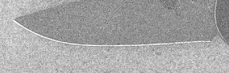
(4) I think scanning at 600 dpi is optimal for small knives. That sounds really high, but suppose we want to accurately trace a 3-inch blade on a 1080p monitor. At 1080p, we have 1920 pixels across the monitor to cover three inches in real life. So that is (1920 pixels)/(3 inches) = 640 dpi. Here is the blade only at 600 dpi (right-click to download or open the full sized image in a new tab).
Here is a test scan with a darker background (just carboard).
Just remember, some modern steels are very hard. (ZDP-189 can be super hard at 65 HRC.) I don’t know if they are hard enough to scratch glass, but I say better safe than sorry.
I’m not having a lot of luck using the scanner, the images are coming out very washed out. I wonder if I’m missing something in the way I’m doing it or if my scanner just isn’t up to it. I’ll try with a camera instead.
I was thinking about the same. That is not to say I’ll make a program for that tomorrow, but who knows… What library/software do you use to convert scanned images into line drawings? I suppose Mathlab doesn’t have tracing features, or does it?
Hmm… A couple of questions?
(1) Which flatbed scanner are you using?
(2) Actually, my flatbed scans are also very washed out. But you can try “auto levels” or “adjust curves” in Photoshop to make it much better (or other image processing software). Maybe try that?
(3) If you like, send me a private message with your scanned image, and I’ll see if it is easily fixable or not.
Oh, that’s an interesting idea. I may try to see if some open-source computer vision library (such as OpenCV) can help us convert scanned images into line drawings.
For my current program, I had to write a small utility function to help me manually trace the photo of the knife
Here’s the photo (scan) of your Benchmade blade, which I cropped using Corel’s Paintshop, and modified using their “edge effects” function. Does something like this help you get closer to what you need? The edge of the blade seems very clear. Maybe you could selectively delete everything but the actual edge.
I cropped out the ruler, but I think it could be included.


